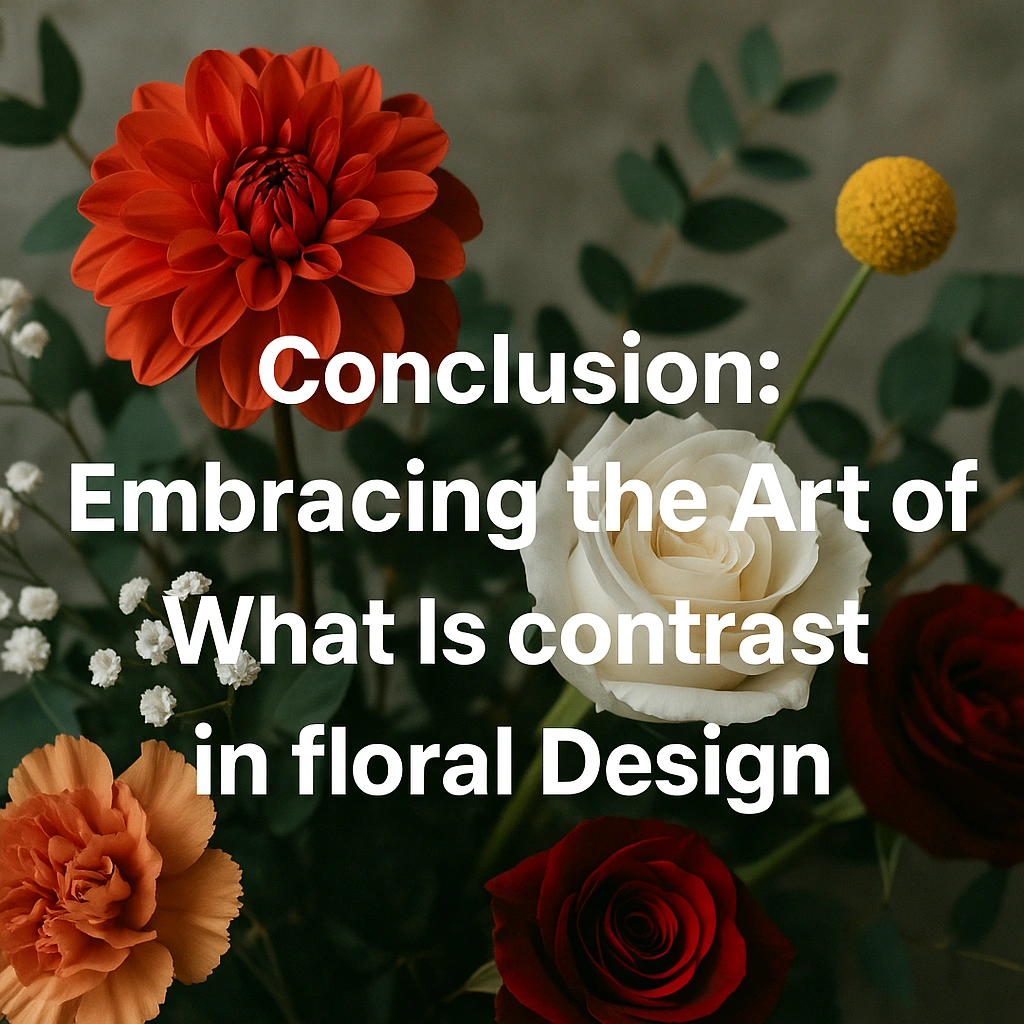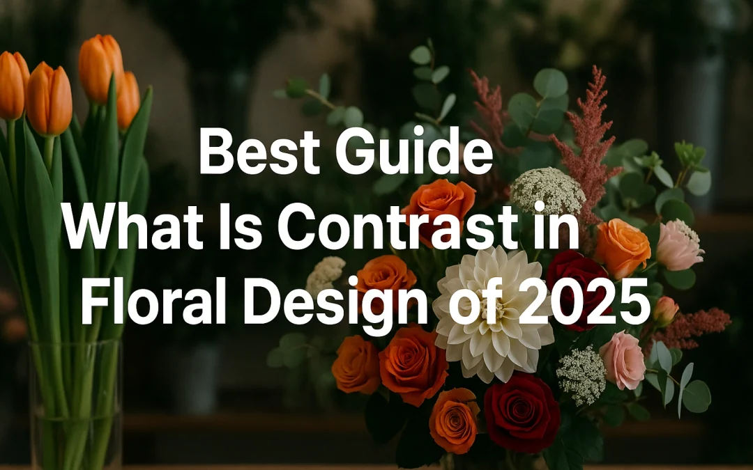
1. Introduction: The Power of what is contrast in floral design
In every memorable floral arrangement, there exists a subtle magic that captures attention and evokes emotion — that magic is contrast. It’s the invisible thread weaving visual energy, balance, and intrigue through petals, stems, and textures. Contrast transforms a simple collection of flowers into an expressive work of art, creating moments of visual surprise that hold the viewer’s gaze. Without it, even the most vibrant blooms can appear lifeless, lacking the visual rhythm that defines professional design.
In the world of floristry, contrast serves as the heartbeat of composition. It brings together opposing qualities — light and dark, soft and coarse, large and small — to produce a harmonious interplay that feels natural yet intentional. The designer becomes both artist and storyteller, using contrast to guide the viewer’s attention, highlight focal flowers, and create movement across the arrangement. It is through contrast that the viewer experiences depth, perspective, and emotion — the very elements that separate an amateur bouquet from a captivating floral display.
A well-balanced use of contrast communicates sophistication and creativity. It allows designers to express mood: bold contrasts can convey drama and excitement, while subtle ones evoke calm and refinement. In every petal pairing and textural choice, contrast invites the audience into a dialogue between harmony and tension — a conversation that defines the essence of great floral art.
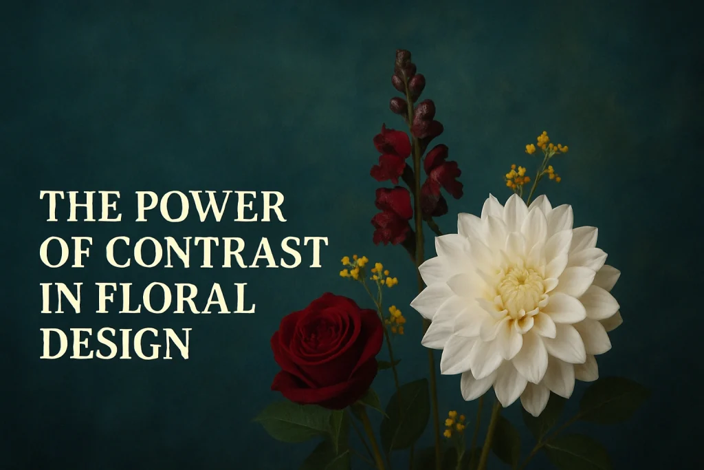
2. Defining Contrast in Floral Design
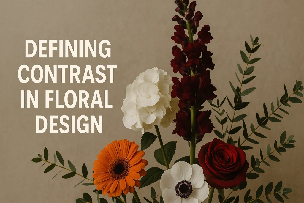
2.1 What Is Contrast?
At its core, contrast is the juxtaposition of differing visual elements to emphasize their differences and create dynamic interest. In art and design, contrast is the art of “difference made meaningful.” In floral design, it means placing elements side by side so that their distinctions — in color, shape, texture, size, or form — become more noticeable and compelling.
In florist parlance, contrast isn’t just “making things different” — it’s about intentional, controlled difference. Contrast helps to:
-
Highlight focal flowers
-
Add depth (foreground vs background)
-
Create visual tension and movement
-
Guide the viewer’s eye through the composition
The American Institute of Floral Designers (AIFD) frames contrast as one of the primary design principles, supported by variation, opposition, and tension as its ancillary concepts. Variation offers mild contrast, opposition is stronger, and tension pushes the contrast further to create impact.
The key is balance: contrast should enrich, not overwhelm.
2.2 Variation, Opposition & Tension: Degrees of Contrast
Understanding degrees of contrast helps you calibrate your design.
-
Variation is a soft or gentle contrast — subtle differences (e.g., slightly different shades of pink).
-
Opposition is stronger — more obvious difference (e.g., pink vs green).
-
Tension is the most extreme contrast — edges pushing against each other (e.g., black and white, sharp spiky forms vs soft petals).
Using a mix of these degrees gives an arrangement both subtle depth and bold moments. Think of variation as the “background rhythm,” opposition as the mid-level punctuation, and tension as the bold exclamation.
Thus, when we talk about “contrast in floral design,” it’s not just one binary switch — it’s a spectrum we can modulate.
3. The Role of Contrast in Floral Composition
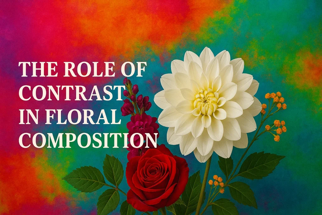
3.1 Contrast and Visual Interest
Without contrast, even the most exquisite flowers can end up looking bland. Contrast injects visual interest — it creates areas of rest and activity, peaks and valleys that keep the viewer’s eye engaged rather than stagnant. Good floral design uses contrast to:
-
Form focal points (dominant elements)
-
Create pathways for the eye (movement)
-
Separate layers (foreground, midground, background)
-
Avoid monotony
A strong use of contrast transforms a flat, one-dimensional arrangement into something with depth, drama, and life.
3.2 Contrast vs Harmony, Unity & Balance
One common misconception is that contrast opposes harmony. In fact, contrast is one of the ingredients of harmony when used judiciously. They are complementary design principles.
-
Harmony / Unity refers to the cohesive integration of all elements — everything works together.
-
Balance ensures visual weight is distributed appropriately (symmetry, asymmetry, open balance).
-
Contrast introduces difference and tension to energize the design.
You must maintain balance and unity while deploying contrast. Too much contrast without coherence becomes chaotic; too little makes the arrangement flat.
When deciding how much contrast to introduce, always ask: Does this enhance harmony or disrupt it? The best designers use contrast to enhance harmony rather than undermine it.
4. Types / Elements of Contrast in Floral Design
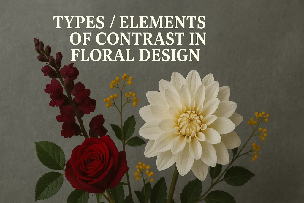
Contrast can manifest in multiple dimensions. Below are the principal ways designers introduce contrast.
4.1 Color Contrast
Color contrast is often the most immediate and visible form. Some common techniques:
-
Complementary colors (across the color wheel): e.g. orange vs blue, red vs green — classic high-impact contrast.
-
Analogous contrast: neighboring hues with different tones or saturations (e.g., light blue vs deep blue).
-
Tonal or value contrast: light vs dark shades of the same hue (e.g. pale pink vs magenta).
-
Warm vs cool contrast: combining warm hues (red, orange) with cool ones (blue, violet).
In floral design, pairing complementary or contrasting hues helps each color read more vividly. For example, yellow flowers with purple accents can pop beautifully.
However, color contrast must respect adjacency and harmony. Too many clashing hues will confuse. Choose one strong contrasting accent, then support with analogous or tonal variations.
4.2 Shape & Form Contrast
Color is obvious; form is often more subtle but equally powerful.
-
Round vs linear: Pair round blooms (roses, peonies) with linear elements (delphinium, reeds).
-
Symmetry vs asymmetry: Symmetrical flowers or clusters contrasted with asymmetrical stems.
-
Organic vs geometric: Soft organic flower shapes contrasted with hard-edged greenery or structural elements.
Mixing shape adds emotion and movement. A rounded rose next to a sharply spired leaf adds drama and helps the eye shift between forms.
4.3 Texture Contrast
Texture contrast is tactile (or visually tactile). Examples:
-
Soft petals vs spiky foliage
-
Smooth leaves vs rough bark or twigs
-
Shiny foliage vs matte elements
-
Delicate filler blooms vs bold large blossoms
Paired properly, contrasting textures deepen the composition, creating layers that invite touch and close-up inspection.
4.4 Size Contrast (Scale & Proportion)
Contrast in scale means pairing large elements with small ones.
-
Large blooms + small filler flowers
-
Tall stems + short accents
-
Wide foliage + narrow stems
You can use scale contrast to emphasize focal blooms or to create depth (small in front, large behind). Always mind proportion: avoid dwarfed elements that feel incongruous.
4.5 Contrast in Line, Direction & Space
Less obvious, but vital:
-
Directional contrast: horizontal stems vs vertical ones
-
Negative space contrast: leaving voids vs dense clusters
-
Line contrasts: straight vs curved, stiff vs flowing
Using contrast in direction orchestrates the movement and rhythm of the design. A curved line next to a straight one adds visual spice. Negative space is also a contrast — space juxtaposed with density draws the eye.
5. Techniques to Create Contrast in Arrangements
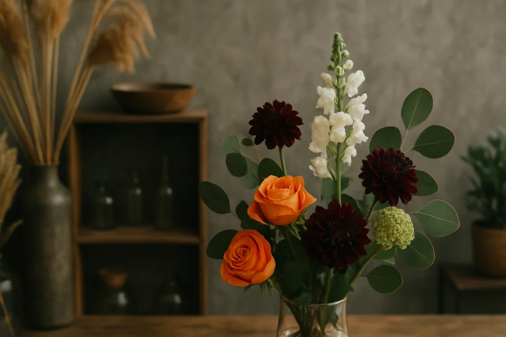
Now that you know types of contrast, here are practical techniques to apply them.
5.1 Selecting Contrasting Colors & Focal Flowers
-
Choose a dominant bloom or accent in a color that contrasts with the palette.
-
Use the color wheel or software tools to test complementary or triadic options.
-
Introduce a bold accent flower (or foliage) to break monotony.
Example: In a largely pastel arrangement, a deep burgundy rose or dark foliage can act as a visual “anchor.”
5.2 Combining Diverse Textures & Foliage
-
Mix soft florals (roses, hydrangeas) with spiky or coarse foliage or filler.
-
Use accent elements like dried grasses, twigs, or seed pods.
-
Alternate rough and smooth in alternating layers to maintain balance.
Textural contrast gives tactile interest and depth even from a distance.
5.3 Varying Shapes, Heights & Depth
-
Use tall stems in back, medium in the middle, short in front (layering).
-
Insert a few stems that break the height pattern to add surprise.
-
Combine round, elongated, and angular forms.
This layering creates forward-back layering, and gives more space for contrast to breathe.
5.4 Using Containers, Backgrounds & Negative Space
-
Use a container that contrasts in color or texture (e.g., a dark vessel for light blooms).
-
Leave negative space intentionally to isolate contrast elements.
-
Ensure the backdrop (wall, table) doesn’t compete — sometimes a contrasting background enhances the arrangement.
Often, contrast isn’t just about the flowers; the context (container, surroundings) matters.
5.5 Light & Shadow, Accent Elements
-
Use light and shadow to emphasize contrast — darker accent blooms can recede or pop depending on lighting.
-
Add accessories (ribbons, branches, metallic elements) with contrasting sheen or color.
-
Use directional lighting for installations to amplify contrast at certain viewing angles.
Especially in installations or exhibitions, controlled lighting becomes part of your contrast toolkit.
6. Examples & Case Studies of Contrast in Floral Design
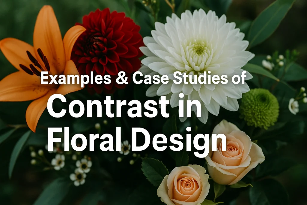
Seeing contrast at work helps anchor theory. Below are example types you can show visually (you’ll want photos in your final version).
6.1 Classic Arrangements with Color Contrast
-
A white and deep purple arrangement: white lilies against dark purple orchids
-
Yellow flowers accented with violet filler
-
Pink/peach blooms with subtle green foliage and one unexpected dark red accent
These show how color contrast draws focal attention.
6.2 Texture-First Designs
-
Mix velvety roses with rough-textured eucalyptus or thistles
-
Combine fuzzy lamb’s ear leaves with glossy calla lilies
-
Use dried grasses next to soft blossoms
Texture-first designs often read better up close and invite touch.
6.3 Dramatic Contrast & High-Tension Styles
-
Black and white floral installations
-
Arrangements with spiky, dramatic structural elements (e.g. thorns, branches) juxtaposed with soft blooms
-
High-art installations pushing contrast to extremes
These are “tension” contrast in action — bold, edgy, arresting.
6.4 Gallery and Before & After Comparisons
Show a “flat” arrangement and then the same arrangement with contrast inserted (e.g. by adding dark accent flowers, textural elements, spacing). This comparative visual storytelling is powerful for readers and helps with image SEO.
7. Common Mistakes & How to Avoid Them
Understanding what can go wrong helps you stay intentional.
7.1 Overdoing Contrast: Jarring or Chaotic Designs
Too much contrast — clashing colors, wildly different textures — can look disjointed. The key: less is often more. Use contrast as spice, not the entire dish.
7.2 Underusing Contrast: Flat or Bland Arrangements
This is the opposite problem: all elements too similar. The arrangement lacks focal interest or depth. Always include at least one contrasting element (color, texture, shape).
7.3 Ignoring Scale and Proportion
Introducing a tiny accent or a massive bloom out of proportion can look absurd rather than artistic. Maintain relative size sensibility.
7.4 Neglecting Harmony & Unity
Even with contrast, the arrangement must feel cohesive. If contrast pieces feel pasted-on, they disrupt harmony. Always tie contrasting elements back into color, shape, or rhythm elsewhere.
7.5 Mismatch in Container, Context, or Setting
A highly contrasted arrangement looks odd in a mismatched vase or setting. The container, background, venue, and environment must support the contrast, not compete.
8. Advanced Tips & Professional Secrets

Here are some expert-level strategies for nuanced contrast.
8.1 Subtle Contrast in Monochromatic / Tonal Designs
Even in a single-color palette, you can layer contrast via tonal variation (light/dark), texture, and form. This is often more elegant and safer for formal events.
8.2 Using Contrast to Guide the Eye & Create Movement
Place contrasting elements not only where you want focus, but in a path — like stepping stones of contrast leading the eye around the design.
8.3 Working with Constraints (Limited Materials, Color Palettes)
-
Use foliage, twigs or secondary elements to create contrast when you lack color variety
-
Lean on shape or texture contrast if color options are constrained
-
Use contrast at scale: contrast a few stems heavily rather than the whole layout
8.4 Evolving Contrast Over Time (for Installations or Changing Displays)
If your arrangement evolves (e.g., over days or seasons), plan contrast so that it shifts — perhaps some accent blooms fade, others emerge, so contrast morphs and the narrative evolves.
9. Further Reading & References

-
AIFD Guide to Floral Design (terms, techniques & traditions) — for deeper principled language, including contrast, rhythm, variation, tension
-
6 Principles of Floral Composition — context, including how contrast fits into balance, rhythm, unity, etc.
-
Bloom College: contrast definitions via opposing lines, colours, shapes, textures
-
Push Your Design: a floristry blog on mastering contrast
- Westcraft Floral blog: types and examples of contrast in floral design westcraft floral